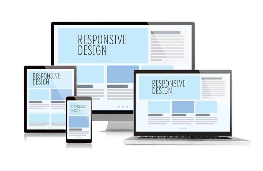
Responsive Layout and Mobile Menu for Online Stores
A complete guide to creating a responsive online store: mobile menu, block layout, image optimization, dynamic script loading, and high performance for sales growth on mobile devices.
Table of Contents
Block Layout and Its Advantages
Today, more than half of users access the internet from mobile devices — smartphones and tablets. This changes the approach to website development: to be successful, an online store must work quickly and conveniently specifically on these devices. Mobile version and responsive design are not just trendy but key factors for increasing conversion rates, retaining customers, and growing sales.
Responsiveness means that the site's content and structure automatically adjust to the user's screen size — text and images scale, the menu becomes convenient, and pages load quickly. The BooStore platform uses a modern approach to layout — block elements DIV are used instead of outdated tables. This simplifies creating flexible layouts and speeds up page loading.
Additionally, loading speed of the mobile version is critical — users often use mobile internet with limited bandwidth. To avoid losing customers, the site must load quickly and minimize unnecessary server requests.
Advantages of Block Layout
Block layout based on DIV provides flexibility, responsiveness, and high performance. Unlike table-based layouts, block layout allows you to:
- Flexibly manage element positioning — reorder blocks on mobile without changing HTML
- Optimize for Core Web Vitals — no nested tables eliminates CLS (Cumulative Layout Shift) issues
- Easily adapt to any screen — media queries work predictably with blocks
- Minimize page weight — clean HTML/CSS without unnecessary wrappers
Image Optimization
Images are the heaviest element on an online store page. Without proper optimization, they can slow down loading by 2-3 times, especially on mobile devices with slow internet.
Key Optimization Techniques
WebP — Modern Format
Use the WebP format, which provides high quality at smaller file sizes compared to JPEG or PNG. On BooStore, conversion to WebP happens automatically upon upload.
Lazy Loading
Use loading="lazy" for deferred image loading. Images are loaded only when they enter the user's viewport. This is configured by default on BooStore.
Explicit Dimensions
Set width and height for each image to avoid layout shifts (CLS). This is critical for mobile version and Core Web Vitals.
Cached Previews
For product lists, create reduced copies of images optimized for block size. BooStore automatically generates cached previews at the required size.
Dynamic Script Loading: Only When Needed
The BooStore platform employs an advanced JavaScript loading mechanism — all scripts are loaded and activated only if the user interacts with corresponding site elements or if the page contains objects requiring script operation. This significantly reduces site load and speeds up loading time.
For example, scripts responsible for pop-ups, changing product quantities in the cart, managing product variations on the product page, the mobile menu, and almost all other interactive features run only upon user clicks or when required elements are present on the page. This approach ensures maximum performance and comfort for visitors, especially on mobile devices with limited resources.
Mobile Menu as an App: Convenience and Functionality
The BooStore platform offers a powerful tool — a mobile menu that works like a full-fledged application. It can be flexibly customized so navigation is as simple and pleasant as possible for users on any device.
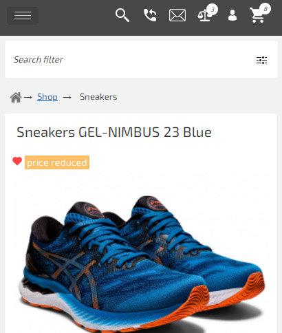
You set the screen width threshold at which the menu automatically switches to mobile mode (for example, for smartphones and tablets). You can also choose icons for the top block (cart, search, personal account, contacts, and more) and build the menu structure from categories, manufacturers, and any pages.
Key Mobile Menu Features
Flexible Appearance Settings
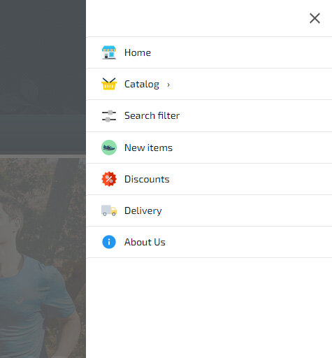
Each item can have its own icon, color, and background. Menu items with dropdown sub-items can include categories, subcategories, and manufacturer lists that load automatically.
Display Modes
The widget supports display modes: left, right, center, or full screen. You can set the screen width threshold for activation or enable mobile menu by default on all pages.
Optimized Loading
Initially, only the button and minimal functionality are loaded. The full menu script with dropdown lists loads only on click. Content is stored in a separate cacheable file.
Search Filter in Menu
You can connect a search filter directly to the mobile menu. For example, a menu item with the link /en/pers_shop/sneakers/#filter opens the filter window on click — product search becomes convenient on mobile.
Built-in Mobile Menu Widget on BooStore
Advanced Mobile Menu Features
The mobile menu supports special links with additional functions:
close— menu close button- empty value — separator
filter— product type selection block for search filter#filter— calls the search filter window on the current page#form-XX— loads popup form by ID#form-call-XX— callback popup form#ajax_page— loads HTML content by relative path
For example, to add a "Contacts" icon, create a contacts page and specify the path /en/contacts.htm#ajax_page (replace "en" with the needed language).
Activation and Display of the Mobile Menu
The mobile menu can be enabled automatically at a specified screen width or always shown on all devices. The menu can be attached to a button or displayed as a top horizontal panel resembling a mobile app — choose the option that best suits your store.
If the mobile menu is not activated, by default the main menu shows a single button that opens a list instead of multiple buttons — a convenient adaptive option without a full mobile menu.
Optimization and Loading Speed
Scripts for the mobile menu and other functions (managing products in cards, quantity changes when adding to cart, pop-ups, etc.) load only as needed, minimizing load and speeding up site performance.
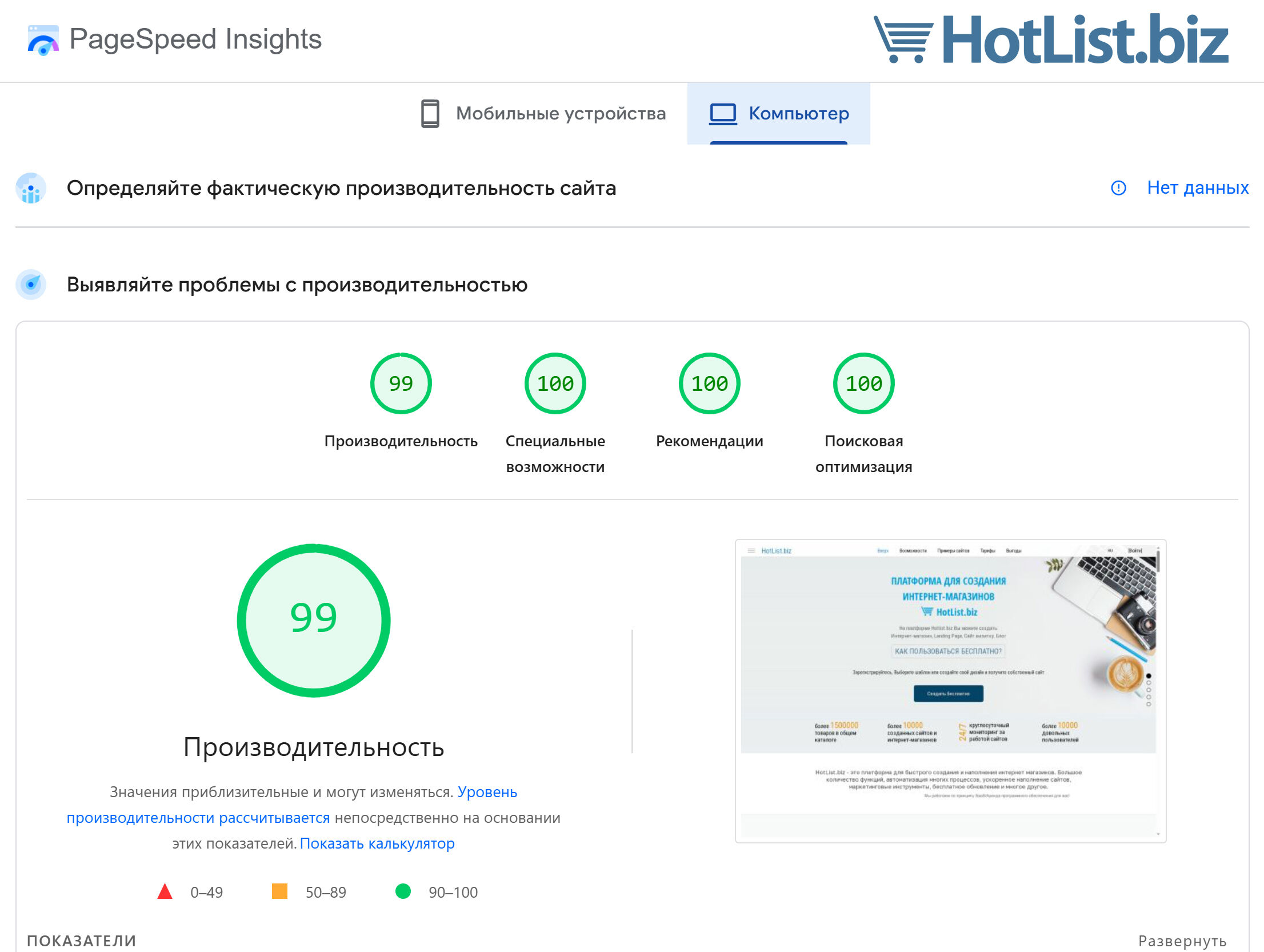
Responsiveness, mobile version, and high loading speed are key success factors for an online store. The BooStore platform offers modern solutions based on block layout and dynamic loading, and the mobile menu allows you to create a convenient and functional interface for mobile users.
Use BooStore tools to make your online store fast, convenient, and attractive for customers on any device.
❓ Frequently Asked Questions about the mobile version of an online store on Boostore
Answers to popular questions about responsiveness, mobile menu, and performance.
Does Boostore have responsive layouts?
Yes, Boostore offers fully responsive design. All templates and block elements automatically adjust to screens of any device — from smartphones to widescreen monitors. Full customization via HTML/CSS/JS is available: you can set custom styles for each resolution, hide or show blocks on specific devices, and optimize the code without restrictions.
Does Boostore have a mobile menu?
Yes, Boostore has a special mobile menu widget that allows you to flexibly customize the appearance and behavior. You can choose the invocation method (hamburger button, swipe, icon), design your own styling, specify custom items and sub-items, and even connect a search filter to the menu — all without programming.
Is the store on Boostore optimized for PageSpeed?
Yes, Boostore delivers the highest performance. The platform includes built-in: deferred loading of scripts and images, CSS and JavaScript compression, multi-level caching, font optimization and code minification. As a result, stores on Boostore consistently achieve PageSpeed 99–100 on desktop and mobile devices.
Does Boostore support mobile sliders and carousels?
Yes, Boostore supports responsive sliders and carousels. You can add product carousels, image galleries and banners that work correctly on all devices. All sliders are speed-optimized — they use lazy loading for images and don't lag even on low-end mobile devices.
How do I check the responsiveness of my store on Boostore?
The easiest way — open your Boostore store in a browser, press F12 (Developer Tools), and select mobile device emulation mode. You can also use the Google Mobile-Friendly Test service or simply open the site on a real smartphone. All stores on Boostore are fully responsive by default.
Will the search filter work on mobile devices?
Yes, the search filter on Boostore is fully adapted for mobile devices. On narrow screens, the filter opens as a sliding panel or modal window — saving screen space without interfering with product browsing. All filtering types are supported: by category, price, attributes, manufacturer, and any custom parameters.